AI Experiment 04
- Buck Bloom
- Feb 18
- 12 min read

AI Experiment 04
The winter weather has been nasty in my area and I have been feeling down. So after the horror of the Pixar style’s use of Roger Corman movie titles, I wanted to have some more fun. And I was curious what other nightmarish creations the AI at Colorify could create.
I decided to come up with horror titles but then after two inputs, I got bored and just went with famous horror movie titles. And WOW! The bounty the AI gave from this experiment is chalk full of nightmare fuel. The uncanny valley pot bubbles over!
These are in no particular rank beside the order I input them into the AI. And I will leave it to you dear reader to rank what covers are more terrifying. IMO, they are all winners of horror!
Before we continue, I’ll give you a taste of what is to come and introduce the very first cover that inspired this experiment:
“The Devil and Mr. Faust”

I like how the font looks and the spacing of the titles. And upon first glance, this looks like a kid friendly version of the classic Faust story about a man selling his soul to the devil. They are even fist bumping, which is a cute touch. But . . .
That old man devil look with one wing and one arm is disturbing. And does he have two noses or is that a sore on his lip? The pointy sideburns AND horns are a bit much. One or the other for your devil design, AI. It’s like having a superhero with both wings AND a cape.
And is the other character supposed to be Faust? I like the red coat and the metal groupie ensemble. But the second character is also a devil with horns and pointy ears and . . . wait? Is that a pink bow on the top of their head? Interesting. It does clash with the rest of their outfit. But okay, to each their own. But what are they holding? A candle? A wand? A dagger?
Is the person in the bottom left Faust? What is going on there? 🫤
I kind of see this as a poster to a family movie about a rookie devil and try to make his grandfather proud. You know what, that is my cannon! Not really a horror movie though.
So, without further ado, let us dive into the horror of the Pixar Style!
*_*_*_*_*_*_*_*_*_*_*_*_*
AI Experiment 04: Pixar Style Horror
Goal: Use Colorify’s Pixar Style to produce a collection of horror story covers. Inputting only titles that could be (or have been) used for horror movies.
*_*_*_*_*_*_*_*_*_*_*_*_*
Number 01, “Heart of Darkness”
“Apocalypse Now” is one of the most horrifying movies I have ever watched. Even after a decade or two after seeing it, it still has stuck with me. And that classic movie is based on the story “Heart of Darkness”. Which, that title is a baller name for any horror story. So, what did the AI do with that badass title . . .

So . . . a literal “Heart-of-Darkness”? It is a heart, with hands and legs, a red outfit with a cape and . . . antlers? This is all kinds of confusing. This is what happens when an AI takes the input to the most logical conclusion without any human filters.
The other characters are an interesting choice. There is a cute girl and heroic dude in the background but they are blurred out. They are so much more intriguing then those who are in the foreground with the heart.
Seriously? What is up with this old man and the dog? They both have dead doll-eyes and a creepy default smile. Actually, if the old guy and the dog were removed and the two in the back were brought forward, that would be cool. This has the vibe of a rom-com, with the candle and rose petals and chocolate. But besides the two in the foreground with the anthropomorphic heart, there is no real horror.
And after how confused and disappointed I was with the lack of horror, I went into the well of horror movies.
Number 02, “The Texas Chainsaw Massacre”
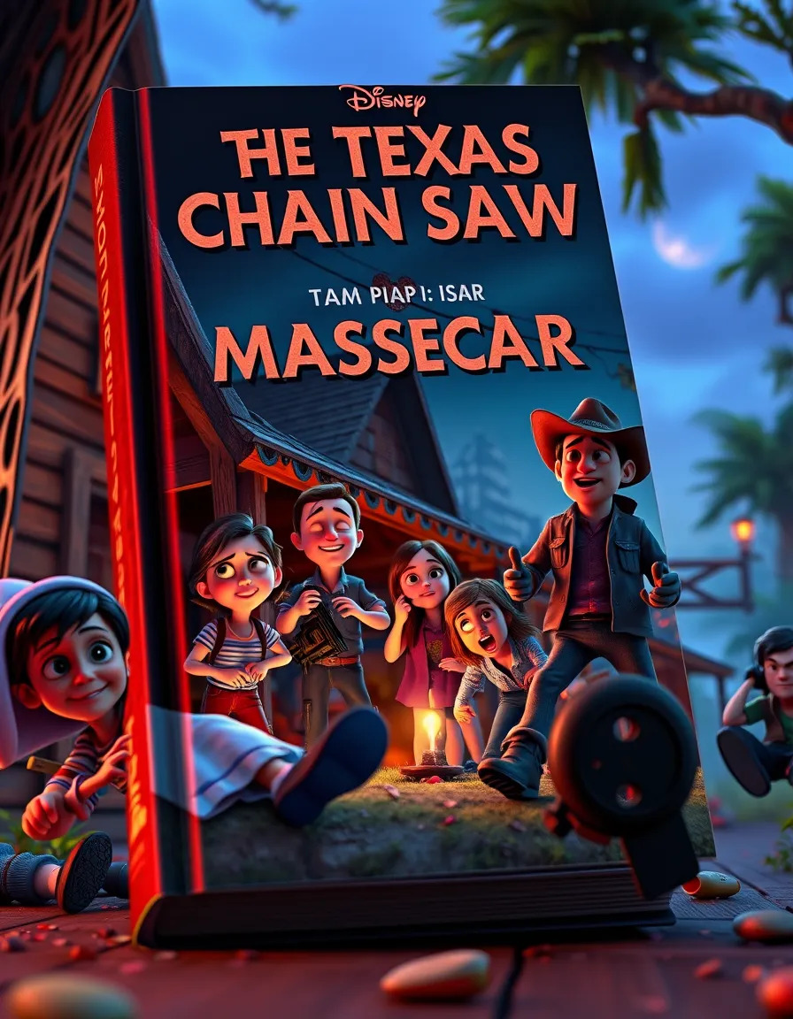
There we go! Now we are burning the nightmare fuel. Look at how horrifying this is! We got people with wanky eyes, especially the cowboy and that one girl on her knees at the center. There people are clearly possessed. The girl at the left is forcing a smile and the guy next to her has his eyes shut and pretending everything is okay.
And the middle girl has flipper fingers, as if her disguise is melting away.
And is that campfire in the middle actually a light bulb? Or the alien spaceship shrunken down?
And for some reason I cannot look away from that one guy in the background to the right. What is going on there? Is he running towards the cover? Is he flying backwards? Is he sitting on air? He is part of the invasion! Get the chainsaw! It’s the only way to save the world!
Number 03, “The Excorist”

What? WHHAAT?
Okay, yeah, there is an old lady with a couple of kids and it looks like they are helping her into her home. But they are not outside, they are clearly indoors and that kid to the left is standing on a dresser. And all those blurry kids in the background have faces that are . . . not quite right.
But let us just put all that aside and not talk about it anymore. Because the star of this cover is that guy bottom left of the cover. First off, his face. His mouth is so tiny. His cheeks are huge and his ear is growing out of his neck. His suit is okay and nothing wrong with his one arm. But . . .
That other arm is an example of the AI having a huge brain fart. His arm is clearly behind the cover. But his hand is on the other side of the cover. And his hand is attached, almost melting, into this mushroom arm thing. Clearly the AI had one thing in mind when beginning the cover’s creation. Then pulled back and did something else over what it initially did.
And I am not complaining. Look at that dude! He is one hundred percent something out of the mind of an AI doing random nonsense. And I am so down for it. I would not be doing this article if not for AI’s bizarre choices.
Number 04, “Dark Universe”
Remember when Universal Studios was going to make a cinematic universe with its monsters from the old black and white horror movies? Most people do not. I am sad that nothing came of it besides one Mummy movie that has no idea what it wants to be. The Dark Universe rose and fell one Summer in 2017. And to honor that flash in the pan, I imputed “dark universe” and got this:

That font for the title is boss. It legit looks like something that would be on an epic movie poster. Honestly, this has “Guardian of the Galaxy” vibes. The three kids look ready for an adventure. The two guys at the left are likely the henchmen of the villain but are the comic relief and will team up with our heroes at the halfway point. And that demon/alien overlord in the background is so freaking cool! All of this on the cover is just pretty damn good for a sci-fi adventure.
But why are the things at the sides of the cover alien guts? Why are their tiny ball aliens and a baby hanging out in them? And why must we have a broken robot right on top of the cover, right in the reader’s face.
Why must the Pixar Style continue to do this? Use the whole space given to make a cover. Why must the AI make it a cover on a landscape with random nonsense going on? Like, so much interesting stuff is blurred out because of that. I want to see the detail in your uncanny creations of the AI. Deliver!
Number 5, “Beetlejuice”

Oh, my, GOSH! This makes me think that the AI is slightly self aware. Look at how Tim Burton this whole thing is. It is as if the AI knows about Beetlejuice and Burton and delivered this amazing Gothic Oddball.
First off, look at that elderly Jack Skellington. Just sitting on his bent, vibing, with his stringy hair and non-existent cane. It is super eerie how close to Jack that guy is. This makes me wonder if the AI has all of the Disney imagery in its database and is all like—
Beetlejuice—> Tim Burton—>Nightmare Before Christmas—>Jack Skellington!
Although, the guy standing in the middle does kind of look like a young Beetlejuice. And his design has that vibe like he is stop motion. And if you look carefully, he has three feet which is nothing out of the ordinary with AI.
But putting the two mains aside, let’s look at the mascots. We have an orange haired girl with this kawaii-goth style going on, with the orange and black dress and light green skin. Her design is overall okay but what is happening with her left arm? It just turns into a . . . nozzle? Maybe she lost her arm and Young Beetlejuice is asking Old Skellington if he’s seen it.
Okay, but the peek of this cover has to be that three faced monstrosity next to the Kawaii-Goth girl. That has to be the most horrifying thing thus far. The head is this dead face pink-furry cat-thingy, the top half is this melting ice cream bunny, and the bottom half is this horrified tiki man. I will admit, not even my wildest dreams (or nightmares) could cook up something so damn bizarre and unsettling.
And the less said about that yellow mouse head next to the monstrosity, the better!
Number 06, “Sinners”
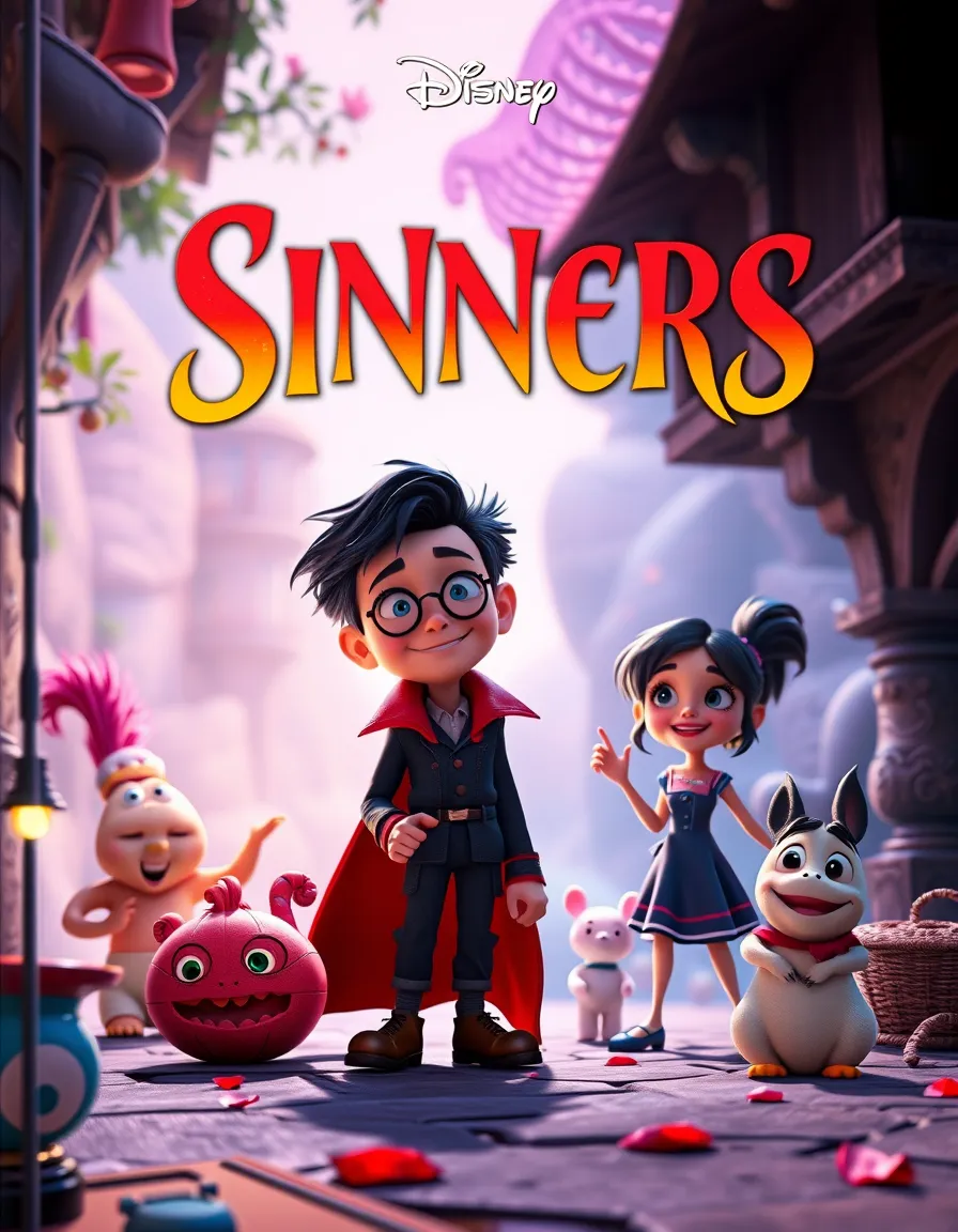
You know, with a title like that, I was expecting something darker even with the Pixar Style. But instead, we get this Harry Potter looking kid with a cape. Pretty disappointing so far but lets look deeper. We have a girl who I assume is the friend/love interest and a sidekick grey rabbit. The pink blob to the bottom left is eerie but in that Kawaii-Goth kind of way. It almost has matching glasses to the Potter kid which could mean it's his familiar.
There is a white teddy bear in the background and . . . wat—da—fuuu—
To the left! What in the absolute holy Hoth is that? It’s like a doll-baby with a creepy smile and . . . does it have two eyes, one set open and the other closed. Or are the closed eyes giant nostrils? And is that a pink feather on its head? Or is that the Cheshire Cat’s tail?
Overall, if that is the most horrifying thing then this is not much of a horror movie. It's more like a weird adventure tale.
Number 07, “Event Horizon”

You know . . . what was I even expecting anymore? When the AI produced this, I did not know how to feel. Take the movie aside, whether you think it is scary horror film or a bombastic action movie, an event horizon itself is a horrifying thing. The “point of no return” around a black hole which not even light can escape? That is a reason to wear your brown pants 😨
And yet, I cannot hate on this cover. The symmetry of that glowing sphere is beautiful. The alien world with the steps leading up to it is legit cool. And the two kids in the foreground approaching the sphere give it a feel of an epic adventure about to begin. But . . .
Zoom in on the two kids in the background. The AI has been blurring background objects and people for most of the Pixar Style covers. And now we learn why. Those kids’ melting faces are the stuff of true nightmares. It is very clear that the AI did not give two shits how anyone looks in the background. I mean, hot damn, that is more like it! More horror like that, MORE!
Number 08, “Evil Dead”

HELL YEAH! That is more like it! Look at this beautiful display of madness and horror! YEs, yES, YeS! That is so freaking awesome!
We have bug-eye characters going full on insane. The guy at the left has three arms and that other guy to the right is all bent and has a ghoulish hand coming out of his throat. And that cat! Wow that cat is no mascot, it is on twenty levels of acid right now. And what is that pink creature in the background? Is it some poor soul who has been mutated?
But we are not done yet! There is a skull face looking cowboy emerging from a burning building. There is a red demon looking dude. There is a woman whose hands are a pen writing into what I assume is the Necronomicon. And there is a possessed tree! I mean, did the AI look up what Evil Dead was and just take inspiration from there!
But if that cover was not enough, the AI blessed us with oddities around it as well. There is blood, skulls, a possessed cat, and I think a skull face pumpkin. And there is a mysterious looking person to the left that because they are blurry, I cannot really make out what is going on.
This is by far and by large the closest to anything horror this experiment has yielded thus far.
How will the rest fare?
Number 09, “The Silence of the Lambs”

Okay. I am not surprised that there are lambs on this cover. I would have been legit surprised if there were not. Each of the lambs in the foreground look free without AI hallucinations or hiccups. The lamb eared child is an interesting touch. So far, it is lacking any horror. But . . .
Background left, behind the lambs, is a lamb without eyes. It is a demon taking on the form of a lamb, ready to silence the herd. But since it is a demon, it cannot let its eyes show, for it will break the disguise. Yeah, that cannon is what I am going with. Never mind that to the left there is a disembodied lamb snout just there at the edge.
Number 10, “The Shining”

Oh, hey! There is a shining light above on this cover. No surprise. And there are a bunch of kids in a field with cute mascot characters dancing under the light. All and all, things are chill. But . . .
But the “SHILNG?” What? I know the AI is prone to word salad but so far, the word salad has not been that egregious. What is even a “shilng?” I have to stop myself from adding an “i” between the “l” and the “n”. It is just so weird after nine other covers that have been fairly decent with the wording.
And the kids are not alright.
That one kid in the foreground to the right, look at their legs. They are not spreading out to welcome the light. They are together, if you look carefully, meaning this chubby kid is twisting their back.
And the girl to the left in the background is melting. This light above is melting and twisting these children, who are lured to their grizzly fate by cute bear creatures . . .
One of those cute bear creatures has moose antlers . . . kay. “The Bearoose Strikes”! That would be a cool horror movie comedy, a rabid bear with moose antlers attacks a secluded town in the middle of the Canadian wilderness.
That I want to see now.
Number 11, “28 Days Later”

What is more terrifying? Fast zombies? Or people who are glitching.
Seriously?! What in the absolute FUDGE is going on here? No one’s eyes are right, especially on the girl to the right. With her dead thousand mile stare just void of . . . anything. Her presents is so chilling that the “ER” at the end of “LATER” ran away. And the rest of the kids around her are just as dead and void of anything. All just sitting on the street, as if all brain function has stopped and something new is now home.
But let’s talk about those protagonists at the center. Usually the AI would focus on the center and make the characters more clear. But no, I am not sure we want to see what they look more clearly. That redheaded girl’s eyes are off with a wanky one and one staring off into nothingness. There is the central girl with her biker gloves and melting face. And then there is . . .
A body with no head. A torso clearly turns away from the camera. One leg walking away with the other walking forward. This is something truly . . . incomprehensible. It is true eldritch horror without the cosmic monster gods. You just look at this and think, “Well, it’s just a bunch of people in a street and WHOA GOD! What is up with that dude with no HEAD?!”
Number 12, “Get Out”

Yeah, we climaxed at “Evil Dead”. This is really disappointing with a title like “GET OUT”. We got some Jerry Lewis looking dude hanging out with a bunch of kids. And are they on a stage? Or an open book? There is a muppet's head on a pike in the background. A kid who is mostly ball. The girl to the left seems a bit off but nothing worse than what we have seen before.
And . . .
I was so bored with this, so I did the “Evil Dead” again and . . .
Number 13, “Evil Dead” II

Look at all that chaos! It is so majestic that I have so very little to say. But I will say this! I can almost hear what that guy at the center is saying right now. With his cheeky smile and badass stance, he is so saying: “Groovy!”
So, before we wrap up, I so wanted to see what “The Bearoose Strikes” would be like. So, I wrote this following description, kept with the Pixar Style, and put it into the Colorify AI prompt:
“A horrifying cover in the dark snowing wilderness. At the center is a black bear with glowing red eyes and moose antlers. The title in scary letters are above the bear says "The Bearoose Strikes". Make it really scary.”
I crossed my fingers 🤞and prayed that being more detailed will deliver something epic.
And the first result was . . .
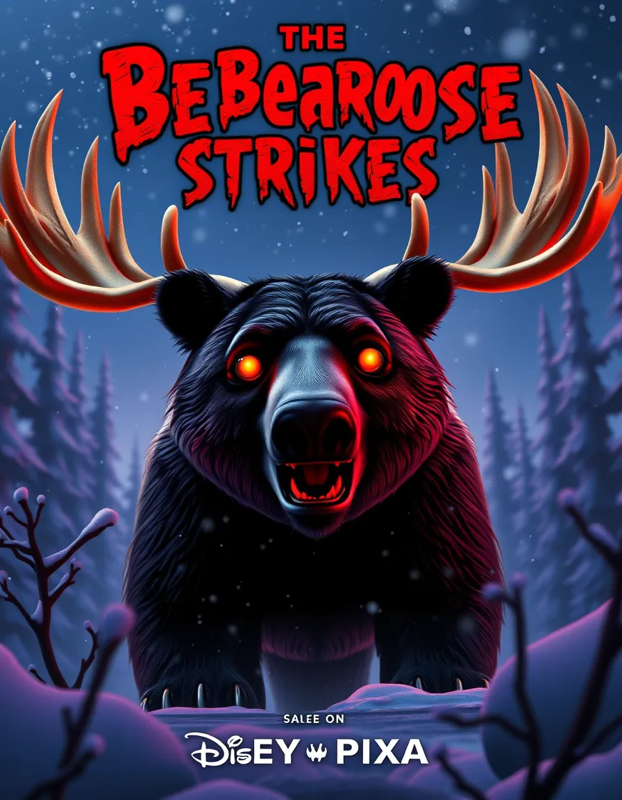
Yes! Perfect! Pixar, please, make this right now! I would so pay good money to see a Pixar horror movie in the theater!
Well, this was fruitful and fun. And we had seen some pretty horrific things in the cutesy style of Pixar. But I think I’ll give the Pixar Style a rest for a while. And next experiment, I will add more to the description. It is fun to see what random nonsense the AI will generate with very few inputs given. Colorfiy’s AI does have a lot to offer and especially with more information.
I look forward to the next experiment!
Good Luck and stay safe in that horrifying winter weather out there,
—BUCK


Comments